The difference between success and failure, can be dictated by your marketing, your pricing, your products and sometimes it's as subtle as your "user experience".
In 1979, English inventor Michael Aldrich pioneered what would eventually become known as eCommerce by connecting television and telephone lines.
The story goes that Aldrich thought of the idea while on a walk with his wife, bemoaning the inconvenience of making regular trips to the market;
"Wouldn’t it be so much easier if you could just order what you needed through the TV?"
Evidently, we haven't stopped moaning about how inconvenient shopping is. No matter how far things have come, the process is often a pain.
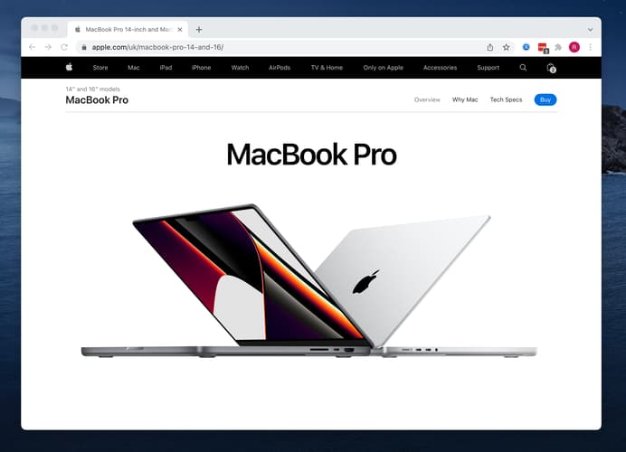
Even some huge corporations are guilty of this, take Apple, for example.
You've seen the beautiful product photos, you've read about the latest Pokémon sounding chip sets, like M1 MAX & M1 ULTRA, and the exciting new colours (which are actually just recycled old colours) and you're sold. You want it. You *need* it.
But where's the blog/how-to-add-full-ecommerce-to-any-existing-website-in-minutes">buy button?
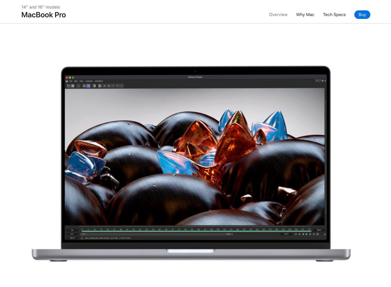
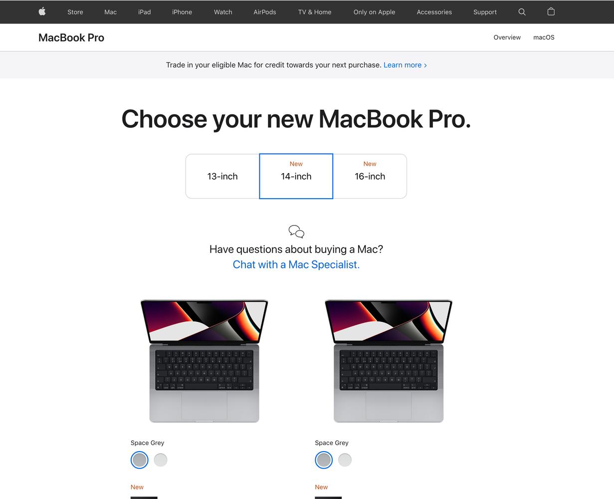
There, hiding in the top right, is the button you need. So you click, expecting to begin the checkout, and instead you're met with 2-3 seconds of load time, only to be presented with a completely different page, where you have to be educated all over again about the different models available.
 blog post" title="Add products to your blog post" class="fr-fic fr-dii">
Infuriated, you make your choices, and click "Select" (not buy?) thinking to yourself;
"This is it, Mac time".
No.
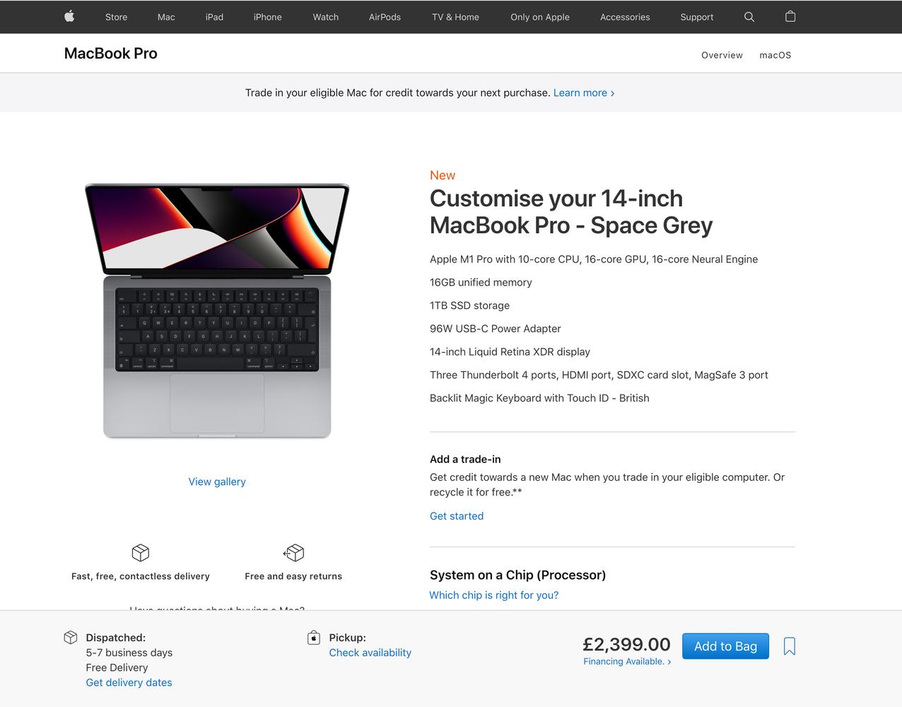
Another 2-3 seconds of loading, and you find yourself on another completely different looking page. Once more you have to compare all the options, and make your choices. But this time, at least, you see hope. There, (at the bottom of the screen now?) is the call to action. "Add to bag".
Yes, you've clicked "buy" and you've clicked "select", but this is different, this is the one.
There's a bag now.
 blog post" title="Sell products in your blog post" class="fr-fic fr-dii">
Another 2-3 seconds of loading, and another new page. The action button has moved again, it's "near" the top this time, and now it's labelled: "Review Bag" There's an infinite list of accessories and other products below to distract you, there's even an advert for Apple TV, which of course links out to another site, abandoning your order completely. You feel the urge to "learn more"...
 embed ecommerce in blog post" title="embed ecommerce in blog post" class="fr-fic fr-dii">
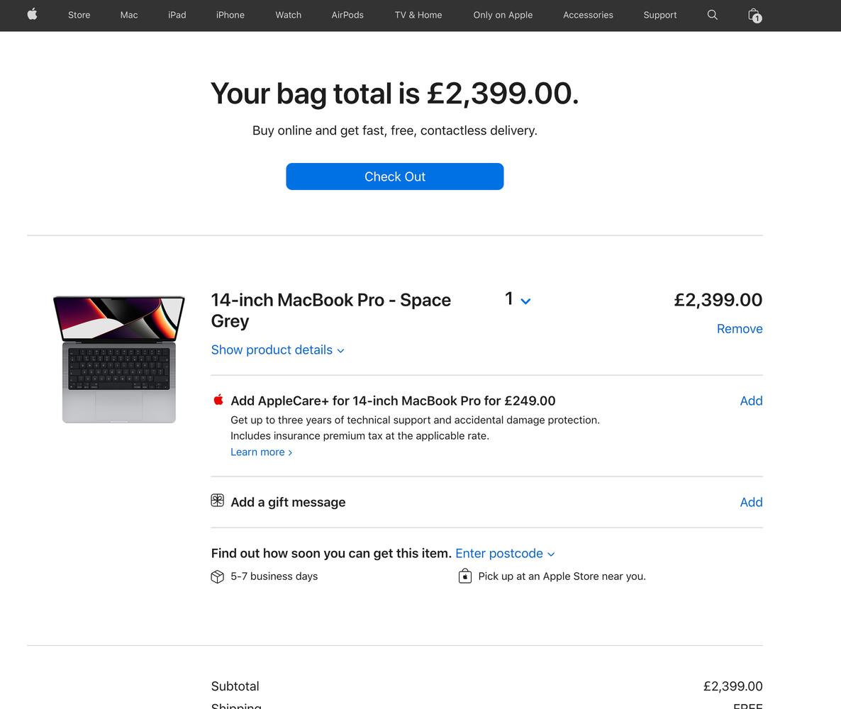
Finally, you click "Review Bag" and after 2-3 seconds more loading, you've made it to the promised land, you see a checkout button.
 ecommerce to my blog" alt="add ecommerce to my blog" class="fr-fic fr-dii">
Surely this is it? Click "checkout" and you'll be able to pay, presumably with Apple pay, which is super quick. One click and it's over. It must be over.
 ecommerce to my blog" title="How to add ecommerce to my blog" class="fr-fic fr-dii">
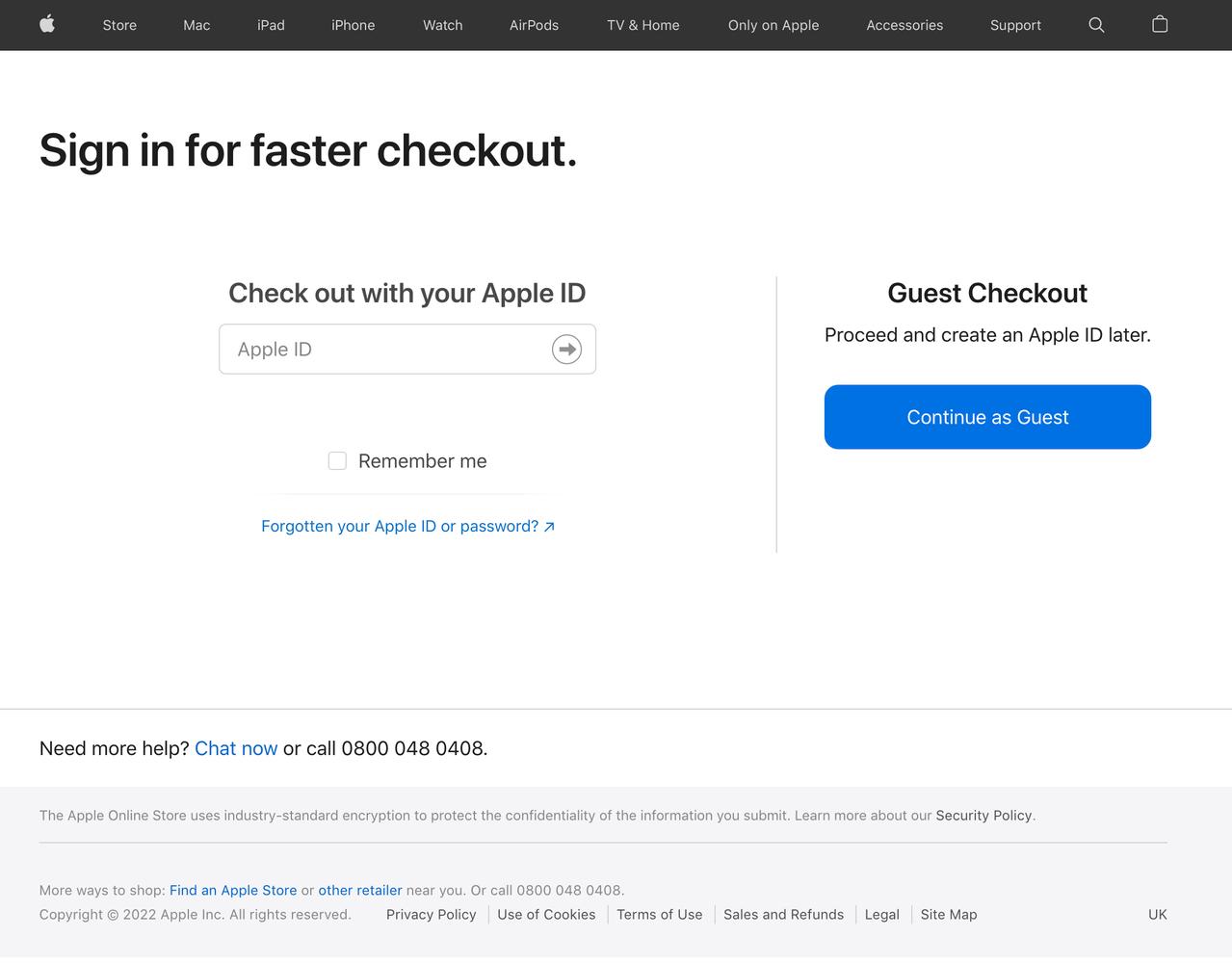
And then you see it. The dreaded "login to checkout" page. You know there's a "continue as guest" option, but in your experience, this is just as bad, if not worse, than the login to checkout flow.
You're starting to doubt this whole thing. How much do you really need a £2,400 laptop? The one you have isn't so bad, it's only 2 years old. Sure a couple of keys have fallen off, and the battery doesn't seem to hold charge as well, and your touch bar is a constant reminder that Apple doesn't care about you, but anything is better than this maze of clicks and buttons and haphazard UX.
One more chance, you click "Continue as guest".
 embed ecommerce into website" title="embed ecommerce into website" class="fr-fic fr-dii">
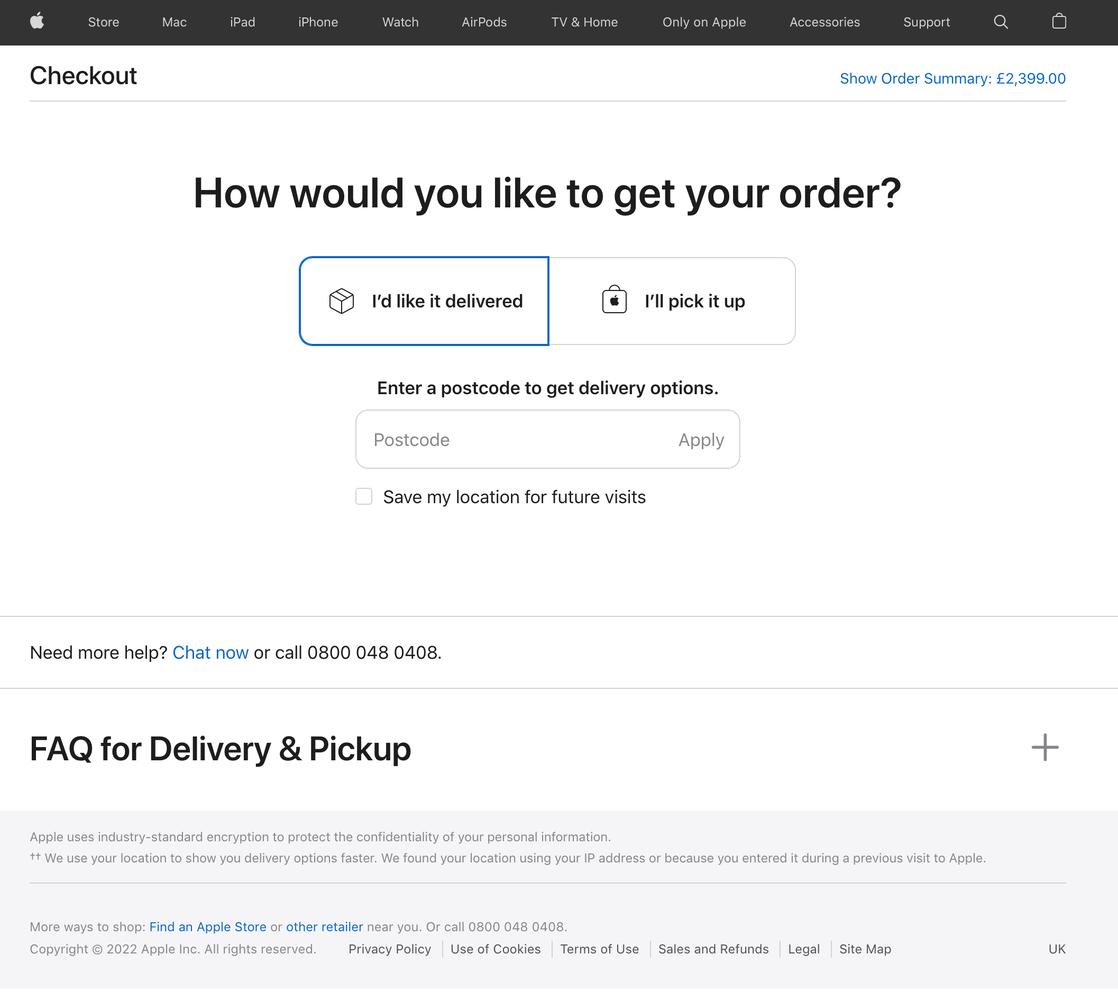
Another new page dedicated entirely to a single question which surely could have been part of any of the numerous previous steps. Obviously you want it delivered, there's Covid out there, you don't want to touch things, no matter how clean the Apple store looks.
Another click. Another page.
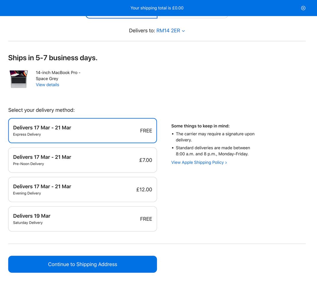
Surprisingly, this page loaded seamlessly, there was no 2-3 second delay, it just appeared below the existing view, and you wonder why all the other pages didn't load like that?
You choose your shipping option, which are all essentially the same option, just with added costs if you'd like it delivered at a time when you're actually home. Continue to shipping address...
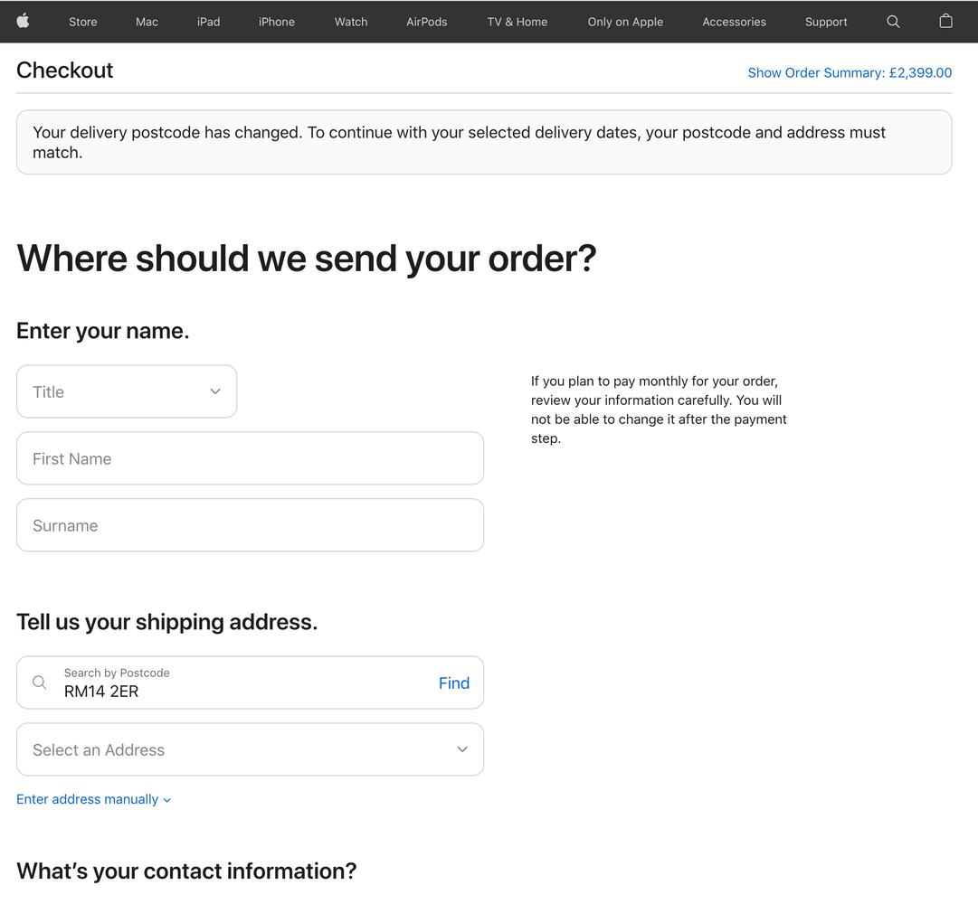
Another 2-3 seconds loading. Then you see the address form, it's pretty long and every action you take seems to add more fields to the form. You wonder if this will ever end.
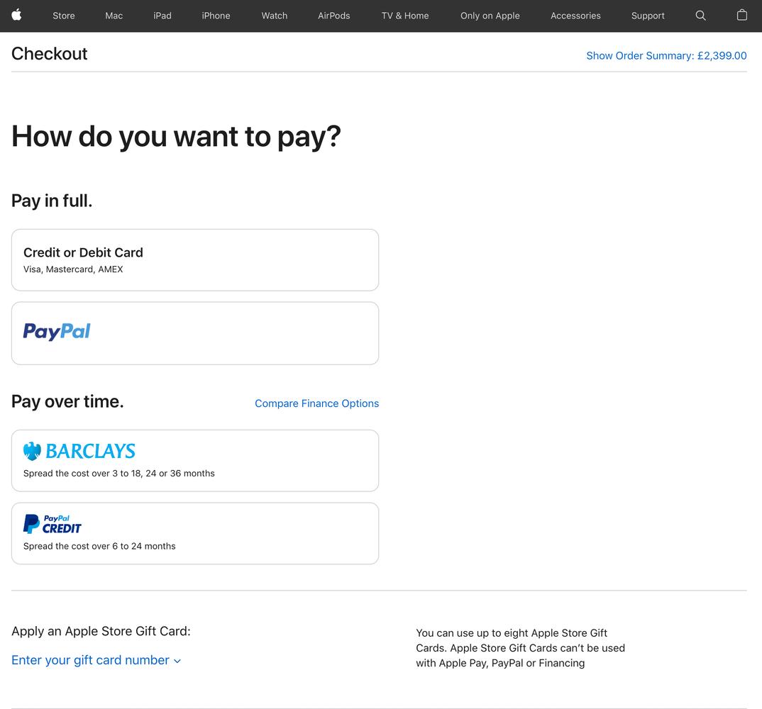
After completing the address, you make it to payment. This HAS to be the end. What more could there be? You realise that you actually did want that extra lightning cable, so you click "edit bag" to quickly add it.
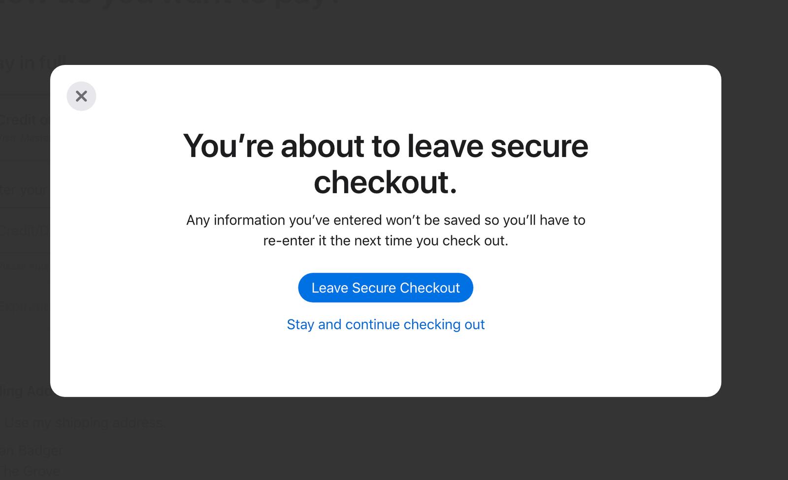 cart to your blog" title="Add shopping cart to your blog"
A modal appears that send a chill down your spine. You risk having to start all over. It's not worth it, forget the cable, you can just buy one on eBay, probably.
For some reason your password manager isn't populating your card details? There's something unusual about how they've integrated the payment form, so password managers don't recognise the fields. So you have to go and find your debit card...
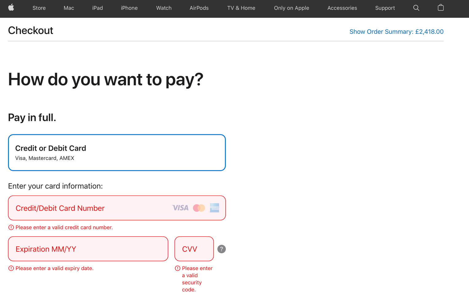
You start to wonder how many people work at Apple. A lot, surely. You wonder if any of them have ever tried shopping from this website? No doubt they get all their Apple products for free from some sort of giant candy bowl in the Apple HQ, why would they be shopping on Apple.com like the rest of us plebeians.
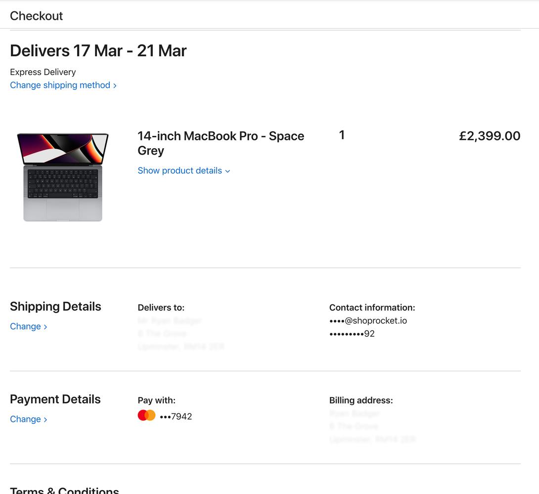
This is it. The final level. There's a button at the very bottom that says "Place your order". You're amazed that there's no way to actually edit your order at this point. You cannot change quantities, you cannot add/remove items from your order. You can almost hear Tim Cook's voice in your head;

"This is your order, take it or leave it".
You pull the trigger. 1 final click...
And just like that, it's over.
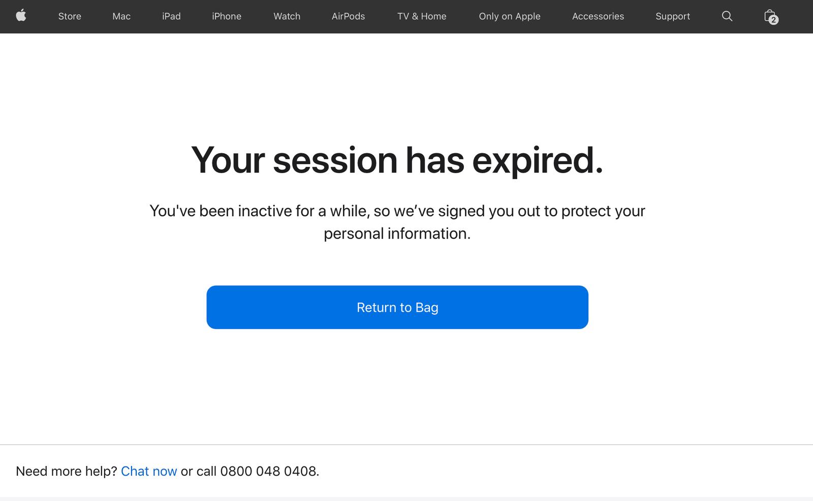
Somehow Apple isn't phased by this truly terrible experience. Perhaps it's intentional? Maybe they want you to feel lost and confused?
You wonder if you could learn form this, but you're not Apple. You don't have that luxury. You have to make sure your checkout is lightning fast, and users can checkout in as few clicks as possible.
Enter Shoprocket
Checkout the below demo, the products are rendered directly into the page where your customer's focus is. Everything is instant. You won't see any loading screens. And you can complete a full checkout in about 30 seconds.
The products below are real - you can interact with them, add them to cart and checkout.
(Please don't pay though! It's just a demo store)
It's taken us 10 years of powering online stores to get to this stage. We've analysed countless sessions, captured millions of data points, and this is the end result. A shopping experience that redefines ecommerce.
At this point we have to point out that we are not affiliated, associated, authorised, endorsed by, or in any way officially connected with Apple, or any of its subsidiaries or its affiliates. The official Apple website can be found at https://apple.com.
The names Apple, Mac, M1 Max/Ultra, Pokémon as well as related names, marks, emblems and images are registered trademarks of their respective owners.
That said - we'd be more than happy to help you get setup with Shoprocket and double your conversion rates, if you're reading Tim....
